Data Cleaning Guide
Introduction
Exploratory Data Analysis (EDA) is an approach to analyzing data sets to summarize the main characteristics and identify incongruencies in the data. Before diving into machine learning or statistical modeling, it is crucial to understand the data you are working with. EDA helps in understanding the patterns, detecting anomalies, checking assumptions, and determining relationships in the data.
One of the most important aspects of EDA is data cleaning. A portion of DataEval is dedicated to being able to identify duplicates and outliers as well as data points that have missing or too many extreme values. These techniques help ensure that you only include high quality data for your projects and avoid things like leakage between training and testing sets.
Step-by-Step Guide
This guide will walk through how to use DataEval to perform basic data cleaning.
Environment Requirements
You will need a python environment with the following packages installed:
dataeval[torch]ordataeval[all]torchvision
We’ll begin by installing the necessary libraries to walk through this guide.
# We need the Counter for processing the labels.
from collections import Counter, defaultdict

# We will need matplotlib for visualing our dataset and numpy to be able to handle the data.
import matplotlib.pyplot as plt
import numpy as np

# We are importing torch in order to create image embeddings.
# We are only using torchvision to load in the dataset.
# If you already have the data stored on your computer in a numpy friendly manner,
# then feel free to load it directly into numpy arrays.
import torch
import torch.nn as nn
import torchvision.transforms.v2 as v2
from torchvision import datasets, models

# Load the classes from DataEval that are helpful for EDA
from dataeval.detectors import Clusterer, Duplicates, Linter
from dataeval.metrics import channelstats, imagestats

# Set the random value
rng = np.random.default_rng(213)
Step 1: Understand the Data
Load the Data
We are going to work with the PASCAL VOC 2011 dataset. This dataset is a small curated dataset that was used for a computer vision competition. The images were used for classification, object detection, and segmentation. We are using this dataset because it has multiple classes and images with a variety of sizes and objects.
If this data is already on your computer you can change the file location from "./data" to wherever the data is stored.
Just remember to also change the download value from True to False.
For the sake of ensuring that this tutorial runs quickly on most computers, we are going to analyze only the training set of the data, which is a little under 6000 images.
However, once you are familiar with DataEval and data analysis, you will want to run this analysis on the validation set and on all of the data together. One thing to look for when checking the other sets of data is to see how the stats of each grouping of data changes (or doesn’t change). DataEval also includes tools to analyze these changes and determine whether there is any bias or correlations in the different sets. However, those tools will not be highlighted in this guide but can be found in the Identifying Bias and Correlations Guide.
# Download the data and then load it as a torch Tensor.
to_tensor = v2.ToImage()
ds = datasets.VOCDetection("./data", year="2011", image_set="train", download=True, transform=to_tensor)
Using downloaded and verified file: ./data/VOCtrainval_25-May-2011.tar
Extracting ./data/VOCtrainval_25-May-2011.tar to ./data
# Verify the size of the loaded dataset
len(ds)
5717
Before moving on, verify that the above code cell printed out 5717 for the size of the dataset.
This ensures that everything is working as needed for the tutorial.
Inspect the Data
As this data was used for a computer vision competition, it will most likely have very few issues, but it is always worth it to check. Many of the large webscraped datasets available for use do contain image issues. Verifying in the beginning that you have a high quality dataset is always easier than finding out later that you trained a model on a dataset with erroneous images or a set of splits with leakage.
All of the DataEval classes currently expect the data to be handed in as a numpy array. Numpy can’t handle different sized images in a stacked array, it requires that all images in the stack be the same size. So instead of loading the dataset into a dataloader, we will load the images into a list that can be processed image by image.
img_list = []
for data in ds:
    img_list.append(data[0].numpy())
In addition to the images, we’ll also need to load the labels. However, there is no standard for metadata associated with images. Thus, we will load the metadata associated with the first image to explore it’s metadata structure and determine exactly what is contained where in the metadata. This way we can extract just the labels for each image.
# Check the label structure
ds[0][1]
{'annotation': {'folder': 'VOC2011',
  'filename': '2008_000008.jpg',
  'source': {'database': 'The VOC2008 Database',
   'annotation': 'PASCAL VOC2008',
   'image': 'flickr'},
  'size': {'width': '500', 'height': '442', 'depth': '3'},
  'segmented': '0',
  'object': [{'name': 'horse',
    'pose': 'Left',
    'truncated': '0',
    'occluded': '1',
    'bndbox': {'xmin': '53', 'ymin': '87', 'xmax': '471', 'ymax': '420'},
    'difficult': '0'},
   {'name': 'person',
    'pose': 'Unspecified',
    'truncated': '1',
    'occluded': '0',
    'bndbox': {'xmin': '158', 'ymin': '44', 'xmax': '289', 'ymax': '167'},
    'difficult': '0'}]}}
Here we can see that the metadata comes through as a nested dictionary. What we need is the “object” key of the dictionary which contains a list of objects in the image. Inside the list are additional dictionaries, one for each object found in the image. Inside these dictionaries, the label can be found via the “name” key.
Let’s run through all of the labels and create a list of lists which just contains the name of each object in each image.
labels = []
for data in ds:
    objects = data[1]["annotation"]["object"]
    names = []
    for each in objects:
        names.append(each["name"])
    labels.append(names)

labels[0]
['horse', 'person']
Double check that the values output from the code above matches the object names from the original metadata we viewed above.
Now that we have a friendly version of the labels for each image, let’s run some label statistics to explore the different objects found in the images.
# This grabs the total number of each object labelled and the number and index of images each object is present in
object_counts = Counter()
image_counts = Counter()
index_location = defaultdict(list)

for i, group in enumerate(labels):
    # Count occurrences of each object in all sublists
    object_counts.update(group)

    # Create a set of unique items in the current sublist
    unique_items = set(group)

    # Update image counts and index locations
    image_counts.update(unique_items)
    for item in unique_items:
        index_location[item].append(i)

# Display the results
print("     Object: Total Count - Image Count")
for obj in list(object_counts.keys()):
    print(f"{obj:>11}:    {object_counts[obj]:>4}     -   {image_counts[obj]:>4}")
     Object: Total Count - Image Count
      horse:     377     -    238
     person:    5019     -   2142
     bottle:     749     -    399
        dog:     768     -    636
  tvmonitor:     412     -    299
        car:    1191     -    621
  aeroplane:     470     -    328
    bicycle:     410     -    281
       boat:     508     -    264
      chair:    1457     -    656
diningtable:     373     -    318
pottedplant:     557     -    289
      train:     327     -    275
        cat:     609     -    540
       sofa:     399     -    359
       bird:     592     -    399
      sheep:     509     -    171
  motorbike:     375     -    274
        bus:     317     -    219
        cow:     355     -    155
From the above table, we can see that this dataset has a total of 20 classes.
Of the classes, person is the class with the highest total object count followed by chair and car , while person, chair and dog are the classes with the highest number of images.
Cow, sheep, and bus are the classes with least number of objects, while the classes with the least number of images are bus, train and cow.
This table helps us see that there is wide variation in
the number of classes per image,
the number of objects per image,
and the number of objects of each class per image.
This highlights an important concept - class balance.
A dataset that is imbalanced can result in a model that chooses the more prominent class more often just because it’s more prominent.
We are not going to address this issue at this time, because we need to first determine if there are images that need to be removed from the dataset,
but it’s important to note that the dataset does not have class balance.
This concept is further explored in the tutorial - Identifying Bias and Correlations Guide.
Now that we’ve looked at our label set, let’s visually inspect random images across the different classes to get an idea of the quality of the data. When inspecting the random images, we want to get an idea of the variety of backgrounds, the range of colors, the locations of objects in images, and how often an image is seen with a single object versus multiple objects.
# Plot random images from each category
fig, axs = plt.subplots(5, 4, figsize=(15, 20))

for ax, (category, indices) in zip(axs.flat, index_location.items()):
    # Randomly select an index from the list of indices
    selected_index = rng.choice(indices)

    # Plot the corresponding image - need to permute to get channels last for matplotlib
    ax.imshow(np.moveaxis(img_list[selected_index], 0, -1))
    ax.set_title(category)
    ax.axis("off")

plt.tight_layout()
plt.show()
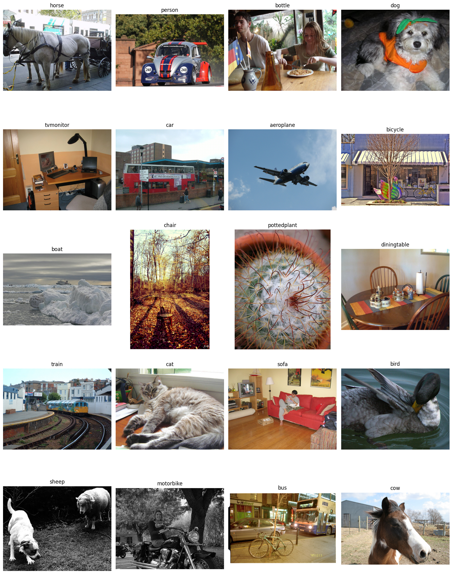
From plotting the images, you can tell that there are a variety of image sizes, image brightness, object sizes, backgrounds, number of objects in the image, and even a few images that are in black and white.
This is where DataEval comes in, it’s designed to help you make sense of the many different aspects that affect building repsentative datasets and robust models.
Summarize the Data
To begin, we are going to utilize two analysis functions. One that grabs the stats for the images as a whole and one that looks at the images on a per channel basis.
The imagestats and channelstats functions have the option to use all built in metrics or to just analyze a few of them.
For more information on customizing the metrics to analyze, checkout the how-to: How to customize the metrics for data cleaning.
# This cell takes about 5-10 minutes to run depending on your hardware

# Calculate the raw stats for the dataset
# The output from compute contains a dictionary of the raw values for each metric
# Note: the stat functions expect the images as an iterable and in the (C,H,W) format
stats = imagestats(img_list)
chstats = channelstats(img_list)
dataset_stats = stats.dict()
ds_channel_stats = chstats.dict()

# View the list of metrics in the image stats class
list(dataset_stats)
['width',
 'height',
 'channels',
 'size',
 'aspect_ratio',
 'depth',
 'brightness',
 'blurriness',
 'missing',
 'zero',
 'mean',
 'std',
 'var',
 'skew',
 'kurtosis',
 'percentiles',
 'histogram',
 'entropy']
# View the list of metrics in the channel stats class
list(ds_channel_stats)
['mean',
 'std',
 'var',
 'skew',
 'kurtosis',
 'percentiles',
 'histogram',
 'entropy',
 'ch_idx_map']
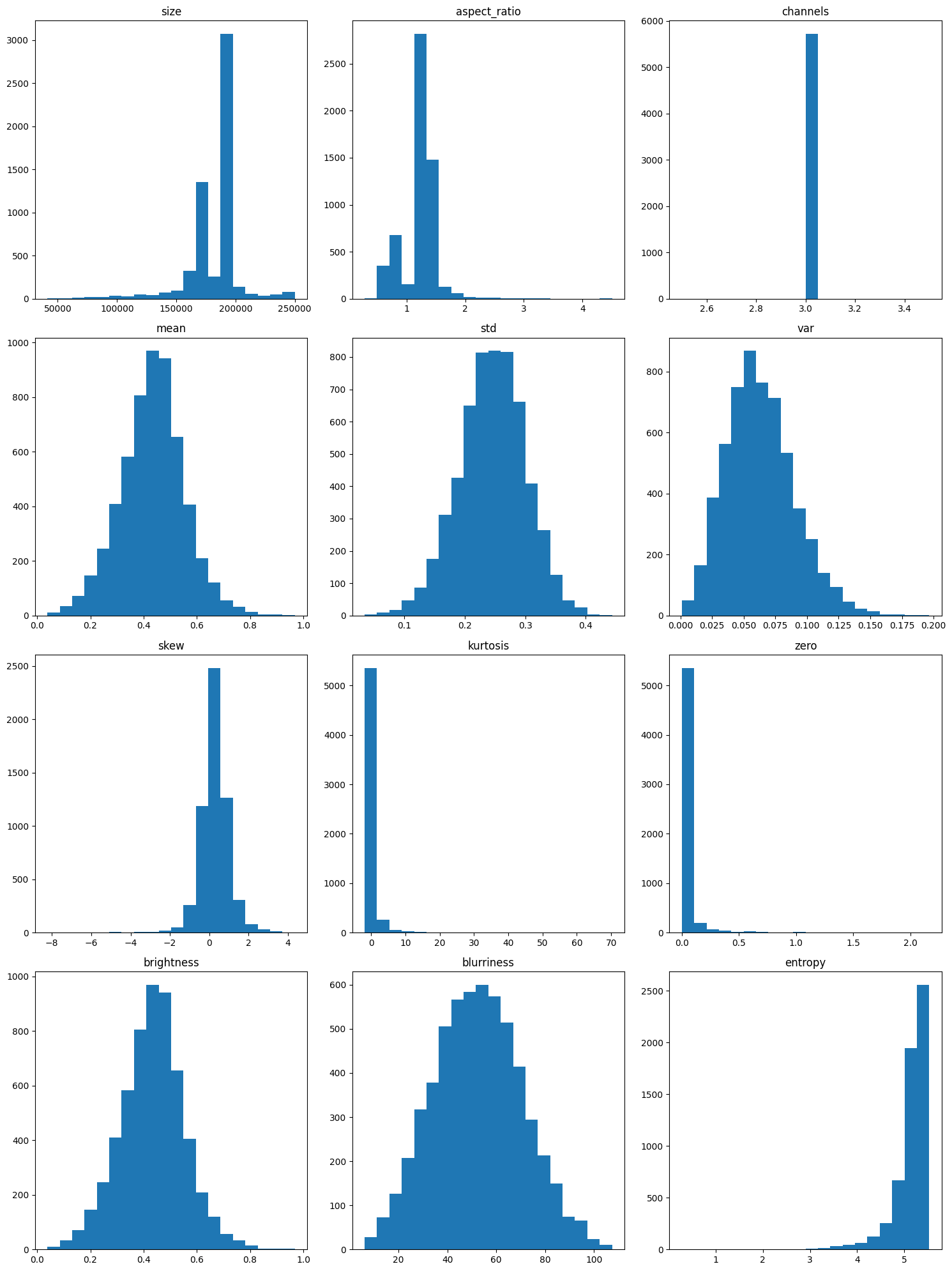
Now that we have our stats computed, let’s visualize them.
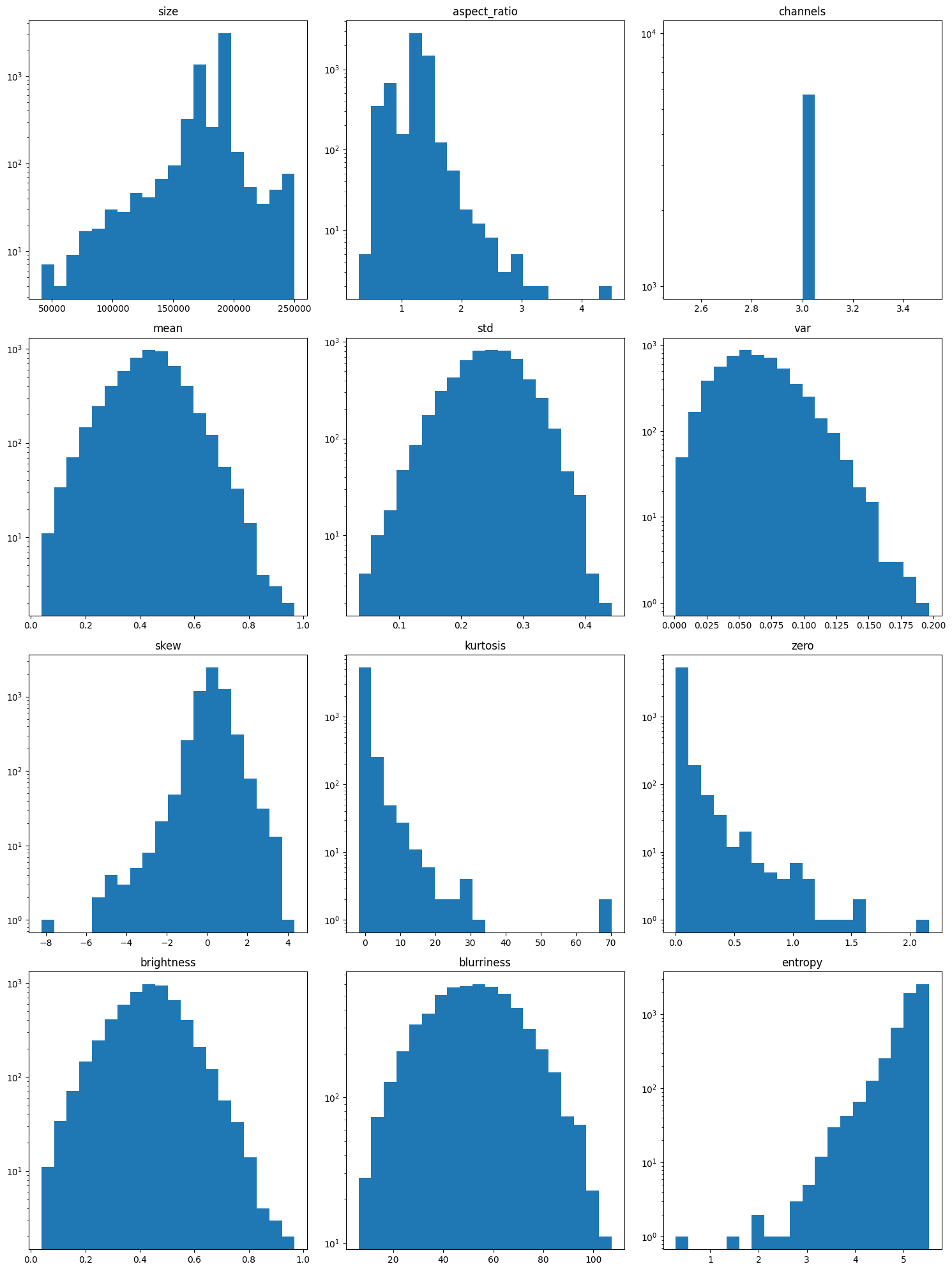
We’ll plot them once normally and once on a log scale to make sure that we can adequately see all of the trends.
Sometimes there are only a few extreme values in a category and they can be easily overlooked if a log scale is not used.
fig, axs = plt.subplots(4, 3, figsize=(15, 20))

for ax, metric in zip(
    axs.flat,
    [
        "size",
        "aspect_ratio",
        "channels",
        "mean",
        "std",
        "var",
        "skew",
        "kurtosis",
        "zero",
        "brightness",
        "blurriness",
        "entropy",
    ],
):
    # Plot the histogram for the chosen metric
    ax.hist(dataset_stats[metric], bins=20)
    ax.set_title(metric)

plt.tight_layout()
plt.show()
fig, axs = plt.subplots(4, 3, figsize=(15, 20))

for ax, metric in zip(
    axs.flat,
    [
        "size",
        "aspect_ratio",
        "channels",
        "mean",
        "std",
        "var",
        "skew",
        "kurtosis",
        "zero",
        "brightness",
        "blurriness",
        "entropy",
    ],
):
    # Plot the histogram on a log scale for the chosen metric
    ax.hist(dataset_stats[metric], bins=20, log=True)
    ax.set_title(metric)

plt.tight_layout()
plt.show()
Plotting the distribution of values for each metric allows us to quickly inspect the metrics for unusual distributions. Without knowing anything about the images, we will assume that each metric should follow one of two types of distributions: normal or uniform.
With a uniform distribution, we want to notice if any of the plots have areas that are a lot shorter or a lot taller than the rest of the values.
With a normal distribution, we are looking at the edges of the bell curve to see if the values near the edges of the plot raise up or if there are gaps between the edge values and the next value in.
We plotted the metrics on both a normal axis and on a log axis because sometimes values at the very edge of the plot can be hidden by the scaling of the normal axis. Looking at the plots, there are a few key things to point out:
The channel metric has only one value, 3. This is interesting since some of the images from our random plot above are greyscale, which usually only has 1 channel.
The entropy, zero and kurtosis metrics are single-tailed and all of them have a long tail which indicates that the images whose values are in the edges of the tail are potentially problematic.
Size, aspect ratio, variance and skew have skewed or off-center distributions which is another sign of problematic images.
Mean, standard deviation, brightness and blurriness appear to have a normal distribution and none have an extended tail, which is a good sign.
While this does not tell us which images are the problematic ones, it gives us some intuition for the metrics we expect the Linter to flag.
From these plots, we expect the Linter to flag images with issues in the following metrics:
entropy,
zero,
kurtosis,
size,
aspect ratio,
variance,
and skew.
Now, let’s analyze the channel stats to see if there are any additional metrics that might be problematic.
fig, axs = plt.subplots(3, 2, figsize=(10, 15))

for ax, metric in zip(axs.flat, ["mean", "std", "var", "skew", "kurtosis", "entropy"]):
    # Plot the histogram for the chosen metric
    # Since each image has 3 channels, a transpose is needed for matplotlib
    # because matplotlib treats the # of columns as different datasets
    if metric == "mean":
        ax.hist(
            np.array(ds_channel_stats[metric][3]).T,
            bins=20,
            density=True,
            color=["red", "green", "blue"],
            label=["Channel 0", "Channel 1", "Channel 2"],
        )
        ax.legend()
    else:
        ax.hist(np.array(ds_channel_stats[metric][3]).T, bins=20, density=True, color=["red", "green", "blue"])
    ax.set_title(f"Channel {metric}")

plt.tight_layout()
plt.show()
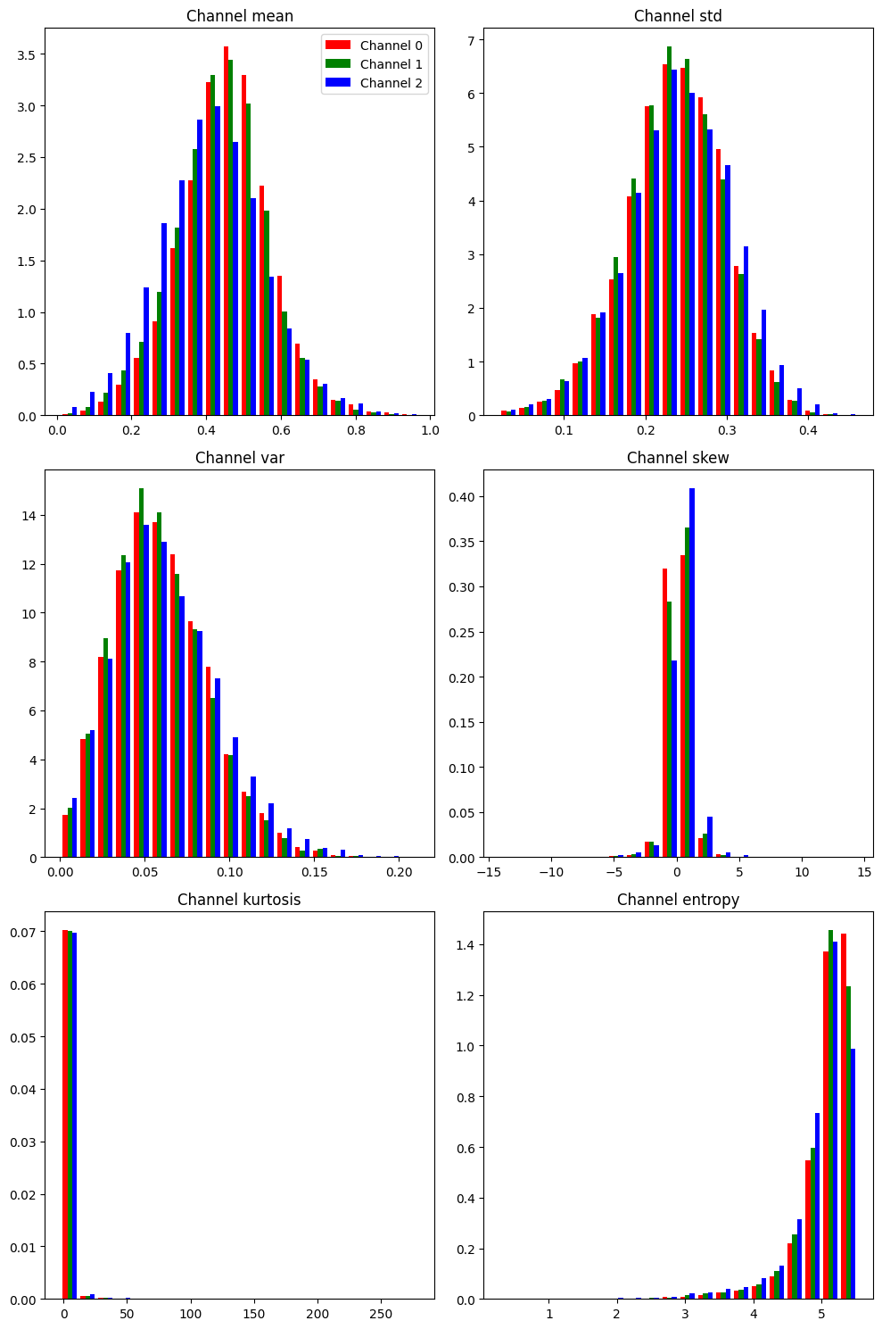
With our understanding from above about uniform and normal distributions, we want to analyze the channel-based metrics with the same principle.
Here we can see that overall shape for each of these channel metrics matches the shape of their counterparts that we already analyzed.
With the channel metrics, we are not as interested in the overall shape in these plots but in the comparison across each of the individual channels.
We want to see if the same shape holds across each channel or if there are large differences between the channels.
This is important because discrepancies across channels can help us detect image processing errors and channel bias.
However, their is very little difference across the channels for each metric.
There is a slight shift in the blue channel for both the mean and skew metrics, but it is not enough of a difference to warrant suspicion.
Thus, no additional metric is added to our list of metrics we expect to get flagged by the Linter:
entropy,
zero,
kurtosis,
size,
aspect ratio,
variance,
and skew.
Let’s move on to identifying which images have a statistical difference from the rest of the images.
Step 2: Identify any Outlying Data Points
Extreme/Missing Values
We want to detect and identify the images associated with the extreme values from our plotted metrics above.
To detect these extreme values, we will use the Linter class.
The Linter class has multiple methods to determine the extreme values, which are discussed in the Data Cleaning explanation.
For this guide, we will use the “zscore” as the Z score defines outliers in a normal distribution.
The output of the Linter class is a dictionary where the image number is the key and the value is a dictionary containing the flagged metrics and their value.
# Initialize the Linter class (with a random image)
lints = Linter(outlier_method="zscore")

# Assign the image stats compute result to the linter class result
lints.stats = stats

# Find the extreme images
lint_imgs = lints._get_outliers()

# View the number of extreme images
print(f"Number of images with extreme values: {len(lint_imgs)}")
Number of images with extreme values: 454
This class can flag a lot of images, depending on how varied the dataset is and which method you use to define extreme values.
Using the zscore, it flagged 447 images across 13 metrics out of the 5717 images in the dataset.
However, switching the method can give different results.
# List the metrics with an extreme value
metrics = {}
for img, group in lint_imgs.items():
    for extreme in group:
        if extreme in metrics:
            metrics[extreme].append(img)
        else:
            metrics[extreme] = [img]
print(f"Number of metrics with extremes: {len(metrics)}")

# Show the total number of extreme values for each metric
for group, imgs in metrics.items():
    print(f"  {group} - {len(imgs)}")
Number of metrics with extremes: 13
  zero - 100
  entropy - 123
  std - 22
  skew - 89
  kurtosis - 73
  size - 173
  brightness - 29
  mean - 29
  aspect_ratio - 33
  var - 35
  width - 43
  height - 22
  blurriness - 2
Digging into the flagged images and organizing them by category, we can see that the metric with the most extreme values is “size” while “blurriness” has the least number of extreme values.
It is also worth noting that the Linter found issues with more metrics than we noticed.
Going back to our list, we had
entropy,
zero,
kurtosis,
size,
aspect ratio,
variance,
and skew.
However, the Linter added mean, standard deviation, brightness, and blurriness.
The Linter is not perfect but it is designed to flag any image that might be problematic.
It is then up to the user to shift through the information provided by the Linter.
Now let’s look into each metric and display how the flagged images are spread across our 20 classes.
# Show each metric by class
# Determine which classes are present in each image
class_wise = {obj: {} for obj in sorted(object_counts.keys())}
for group, imgs in metrics.items():
    for img in imgs:
        unique_items = set(labels[img])
        for cat in unique_items:
            if group not in class_wise[cat]:
                class_wise[cat][group] = 0
            class_wise[cat][group] += 1

# Create the table for displaying
table_header = ["      Class"]
for group in sorted(metrics.keys()):
    table_header.append(f"{group:^10}")
table_header.append("  Total")
table = [table_header]
for class_cat, results in class_wise.items():
    table_rows = [f"{class_cat:>11}"]
    total = 0
    for group in sorted(metrics.keys()):
        if group == "aspect_ratio":
            if group in results:
                table_rows.append(f"{results[group]:^12}")
                total += results[group]
            else:
                table_rows.append(f"{0:^12}")
        else:
            if group in results:
                table_rows.append(f"{results[group]:^10}")
                total += results[group]
            else:
                table_rows.append(f"{0:^10}")
    table_rows.append(f"  {total:^5}")
    table.append(table_rows)
Linting Issues by Metric Table
# Display the table
for row in table:
    print(" | ".join(row))
      Class | aspect_ratio | blurriness | brightness |  entropy   |   height   |  kurtosis  |    mean    |    size    |    skew    |    std     |    var     |   width    |    zero    |   Total
  aeroplane |      7       |     0      |     7      |     28     |     5      |     23     |     7      |     12     |     30     |     6      |     1      |     1      |     2      |    129
    bicycle |      0       |     0      |     1      |     3      |     0      |     2      |     1      |     10     |     3      |     0      |     0      |     5      |     3      |    28
       bird |      3       |     0      |     1      |     16     |     1      |     12     |     1      |     10     |     14     |     5      |     0      |     1      |     9      |    73
       boat |      7       |     0      |     1      |     6      |     4      |     2      |     1      |     8      |     3      |     2      |     0      |     0      |     1      |    35
     bottle |      1       |     0      |     3      |     10     |     0      |     8      |     3      |     10     |     8      |     1      |     3      |     6      |     10     |    63
        bus |      2       |     0      |     1      |     2      |     0      |     2      |     1      |     5      |     2      |     1      |     1      |     1      |     3      |    21
        car |      4       |     0      |     1      |     6      |     3      |     2      |     1      |     18     |     1      |     0      |     3      |     3      |     7      |    49
        cat |      1       |     0      |     1      |     5      |     3      |     3      |     1      |     24     |     2      |     3      |     9      |     4      |     11     |    67
      chair |      1       |     0      |     3      |     9      |     1      |     5      |     3      |     13     |     5      |     0      |     1      |     3      |     12     |    56
        cow |      0       |     0      |     0      |     1      |     1      |     1      |     0      |     3      |     1      |     0      |     1      |     2      |     1      |    11
diningtable |      0       |     0      |     0      |     2      |     0      |     1      |     0      |     6      |     2      |     0      |     2      |     0      |     4      |    17
        dog |      2       |     1      |     2      |     8      |     2      |     1      |     2      |     23     |     2      |     3      |     2      |     7      |     6      |    61
      horse |      1       |     0      |     0      |     2      |     0      |     0      |     0      |     5      |     0      |     0      |     0      |     0      |     2      |    10
  motorbike |      1       |     0      |     1      |     3      |     0      |     2      |     1      |     8      |     2      |     0      |     2      |     1      |     3      |    24
     person |      4       |     0      |     9      |     35     |     2      |     24     |     9      |     61     |     27     |     1      |     7      |     18     |     41     |    238
pottedplant |      0       |     0      |     1      |     1      |     0      |     0      |     1      |     4      |     2      |     0      |     4      |     0      |     3      |    16
      sheep |      1       |     1      |     0      |     0      |     0      |     1      |     0      |     3      |     1      |     0      |     1      |     0      |     1      |     9
       sofa |      1       |     0      |     0      |     3      |     1      |     1      |     0      |     8      |     1      |     0      |     3      |     3      |     3      |    24
      train |      3       |     0      |     2      |     4      |     2      |     0      |     2      |     9      |     0      |     1      |     4      |     2      |     4      |    33
  tvmonitor |      1       |     0      |     0      |     2      |     2      |     3      |     0      |     7      |     2      |     0      |     0      |     1      |     7      |    25
Some of the things to note from splitting up the issues by class and metric:
An image with an unusual aspect ratio is most likely to contain a boat or aeroplane
An image with an issue in brightness (really bright or really dark) is most likely to contain a person or an aeroplane
Images with low entropy (think image with constant pixels) are likely to fall within 1 of 4 classes: aeroplane, bird, bottle, person
Unusual skew and kurtosis images follow a similar trend as entropy
There appear to be other trends as well.
Something to remember is that there are different number of images for each class.
For example, 36 low entropy images out of the 2000 for person might be outliers while 28 low entropy images out of 300 for aeroplane might not be;
low entropy might be an inherent characteristic of class aeroplane.
In order to understand the above table, we are going to plot sample images from a few of the metrics.
We will look at entropy, size, zero and blurriness.
Entropy because Entropy, Variance, Standard deviation, Kurtosis, and Skew all measure (in slightly different ways) how much change there is across the pixels in the image, and entropy will be the easiest to understand.
Size because Size, Width, Height and Aspect Ratio are all interrelated and size has the most extreme images from those.
Zero is a category unto itself but it is closely related to Mean and Brightness. Zero measures images that have a significant number of pixels with a zero value compared to the average image.
Blurriness because it is also in it’s own category. Blurriness measures the sharpness of lines in an image.
Questions
When looking at these images, we want to think about the following questions:
Does this image represent something that would be expected in operation?
Is there commonality to the objects in the images? Such as all the objects are found on the leftside of the images.
Is there commonality to the backgrounds of the images? Such as similar colors, darkness/brightness, places, things (like water or snow).
Is there commonality to the class of objects in the images? Such as a specific pose for person or specific pot color for pottedplant.
Entropy
# Plot random images from each metric
fig, axs = plt.subplots(3, 4, figsize=(15, 10))
selected_index = rng.choice(metrics["entropy"], 12, replace=False)

for i, ax in enumerate(axs.flat):
    # Plot the corresponding image - need to permute to get channels last for matplotlib
    ax.imshow(np.moveaxis(img_list[selected_index[i]], 0, -1))
    ax.set_title("Entropy")
    ax.axis("off")

plt.tight_layout()
plt.show()
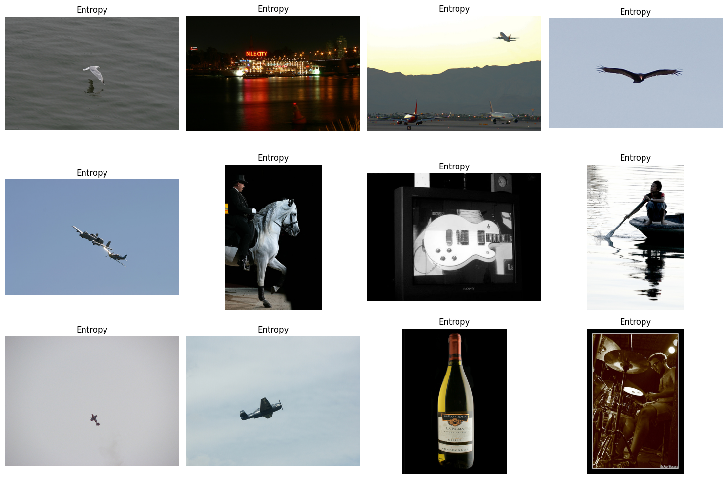
Looking at the flagged images for entropy, what do we see?
That many of the flagged images here have an almost constant background.
Thinking back to our questions - how many of these backgrounds will we see in operation? Are we likely to find water in our images or an object in the sky?
It is also worth pointing out the number of images that have a relatively dark background. How likely are we to encounter night time or dark images in our operation?
If water or objects in the sky or dark backgrounds are expected, then we may just need to collect more images with these kinds of backgrounds. If not, then they are outliers that can be discarded.
To learn more about data collection, go here.
Size
# Plot random images from each metric
fig, axs = plt.subplots(3, 4, figsize=(15, 10))
selected_index = rng.choice(metrics["size"], 12, replace=False)

for i, ax in enumerate(axs.flat):
    # Plot the corresponding image - need to permute to get channels last for matplotlib
    ax.imshow(np.moveaxis(img_list[selected_index[i]], 0, -1))
    ax.set_title("Size")
    ax.axis("off")

plt.tight_layout()
plt.show()
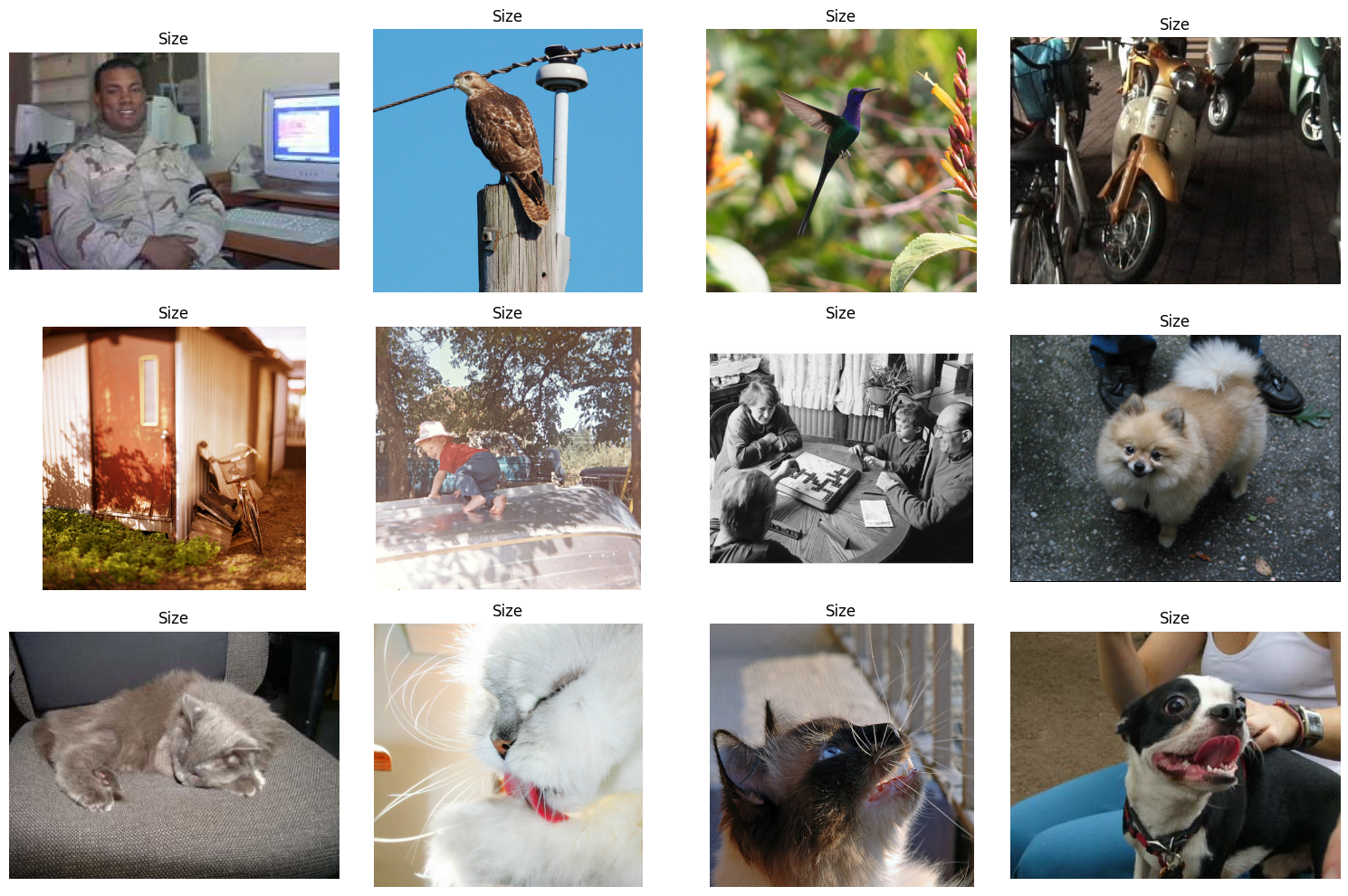
Before we get into these images, you need to decide whether your model workflow will preprocess images to be the exact same size or if you only want to only include images of a specific size.
If preprocessing the images, you will want to make sure that your method does not cause distortions to the image (such as resizing) and that you still have the desired information in the image (such as when cropping).
If you are expecting an image of a specific size, then you can easily just discard the incorrectly sized images.
However, you will want to use the Identifying Bias and Correlations Guide to make sure that this does not introduce any bias into your dataset.
Now that you’ve thought about your workflow, let’s look at the flagged images for size.
The first thing of note is that there are a lot of images here with animals. With that, we want to think about is this an artifact of how pictures are taken of animals or just a by product of the data collection methods? Recalling from the table above, issues with size are pretty spread out across all classes, so dropping all of them might be okay, but you will definitely want to check for bias after dropping them.
Zero
# Plot random images from each metric
fig, axs = plt.subplots(3, 4, figsize=(15, 10))
selected_index = rng.choice(metrics["zero"], 12, replace=False)

for i, ax in enumerate(axs.flat):
    # Plot the corresponding image - need to permute to get channels last for matplotlib
    ax.imshow(np.moveaxis(img_list[selected_index[i]], 0, -1))
    ax.set_title("Zeros")
    ax.axis("off")

plt.tight_layout()
plt.show()
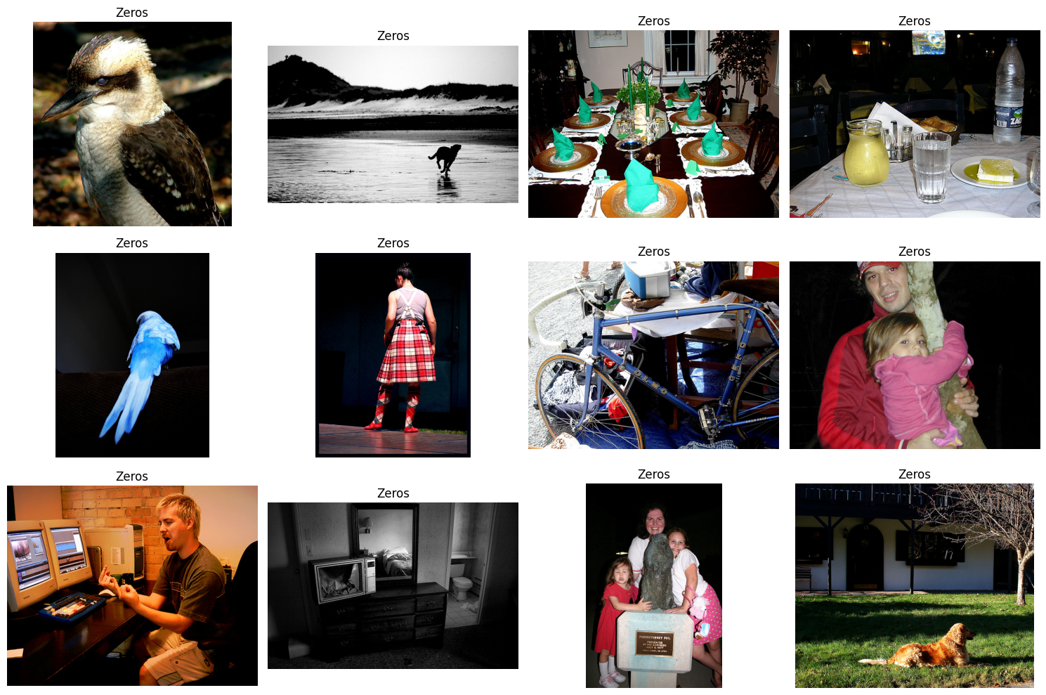
Looking at the flagged images for zero, what do we see?
Similarly to entropy, some of these images have a dark background, which we addressed above.
Also, of note is the grayscale images. Here, we want to think about how often will we come across greyscale images in operation, and can a malfunction in the pipeline (either hardware or software) produce greyscale images and if so how likely will that kind of malfunction occur?
For both of those cases, dark backgrounds and greyscale images, do they occur proportionately throughout all of the classes or do they exist in only 1 or 2 classes? If they occur in only 1 or 2 classes, then you might just want to throw them out so that your model doesn’t just learn to associate dark backgrounds or greyscale with those classes.
Blurriness
# Plot random images from each metric
fig, axs = plt.subplots(1, 2, figsize=(8, 4))
selected_index = metrics["blurriness"]

for i, ax in enumerate(axs.flat):
    # Plot the corresponding image - need to permute to get channels last for matplotlib
    ax.imshow(np.moveaxis(img_list[selected_index[i]], 0, -1))
    ax.set_title("Blurriness")
    ax.axis("off")

plt.tight_layout()
plt.show()
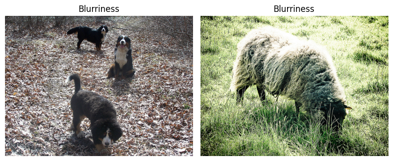
Looking at the flagged images for blurriness, what do we see?
That neither of these images appear to be blurry, but they may actually have a higher resolution than the rest of the images, thus they are significantly less blurry than average.
Also of note, is the background to the images, the grass and the leaves. Are those common backgrounds or are these the only images with a close up with leaves and grasses background?
Is this operationally relevant? If not, then these two images should just be removed. If yes, then additional images are needed with these two backgrounds.
Linting Summary
The Linter can not tell you what is operationally relevant, but it does inform about which images stand out from the rest in one way or another.
After viewing these images that stand out, there are two key takeaways to keep in mind:
Many of the flagged images will be flagged by more than one metric.
Plotting the flagged metrics allows us to get an idea of what the
Lintercalls an outlier. Not all of these images are outliers, some of them could represent areas in our dataset that are underrepresented.
DataEval is used to identify images which may be problematic in your dataset, but it cannot specify whether an image is actually an outlier or not.
Applying the four questions above to each image that stands out, will help you in determining whether the image should be removed or not from the dataset.
Duplicates
We will move onto detecting and identifying any duplicates.
The Duplicates class identifies both exact duplicates and potential (near) duplicates.
Potential duplicates can occur in a variety of ways:
Intentional permutations
Images with varying brightness
Translating the image
Padding the image
Cropping the image
Unintentional changes
Copying the image from one format to another (png->jpeg)
Including a permuted image and the original
# Initialize the Duplicates class (with a random image)
dups = Duplicates()

# Find the duplicates
dup_imgs = dups.evaluate(img_list)

# View the duplicates
dup_imgs
DuplicatesOutput(exact=[], near=[])
As expected there are no duplicates in this dataset, since it was curated for a specific competition.
However, to highlight the abilities of the Duplicates class we are going to add some duplicates to our image stats and rerun the Duplicates class.
# Copy images to create exact duplicates
img_list2 = [img_list[23], img_list[46]]

# Copy and crop images to create near duplicates
img5 = img_list[5][:, 5:-5, 5:-5]
img4376 = img_list[4376][:, :-5, 5:]

img_list2.extend([img5, img4376])
# Find the duplicates using the modified dataset
dup_imgs = dups.evaluate(img_list + img_list2)

# View the duplicates
dup_imgs
DuplicatesOutput(exact=[[23, 5717], [46, 5718]], near=[[5, 5719], [4376, 5720]])
As we can see, it identified images 5717 and 5718 as the exact duplicates that we copied from images 23 and 46, respectively. It also correctly identified as near duplicate images, images 5719 and 5720 that we copied and cropped from images 5 and 4376, respectively.
Outliers
Now that we’ve explored the extreme images and identified duplicates, we want to detect and identify those images which are outside of their class distribution.
For this detector, we need to translate the images into image embeddings as the images themselves are too big for the Clusterer class to handle efficiently.
The Clusterer works best when the feature dimension is around 250 or less.
For this guide, we will use a pretrained ResNet18 model and adjust the last layer to be our desired dimension of 128. Also, pretrained torchvision models come with all the necessary information for preprocessing your images correctly for that model.
# Define the embedding network
class EmbeddingNet(nn.Module):
    def __init__(self):
        super().__init__()
        self.model = models.resnet18(weights=models.ResNet18_Weights.DEFAULT)
        self.model.fc = nn.Linear(self.model.fc.in_features, 128)

    def forward(self, x):
        x = self.model(x)
        return x


embedding_net = EmbeddingNet()
device = torch.device("cuda" if torch.cuda.is_available() else "cpu")
embedding_net.to(device)


# Extract embeddings
def extract_embeddings(dataset, model):
    model.eval()

    embeddings = torch.empty(size=(0, 128)).to(device)
    with torch.no_grad():
        images = []
        for i, (img, _) in enumerate(dataset):
            images.append(img)
            if (i + 1) % 64 == 0:
                inputs = torch.stack(images, dim=0).to(device)
                outputs = model(inputs)
                embeddings = torch.vstack((embeddings, outputs))
                images = []
        inputs = torch.stack(images, dim=0).to(device)
        outputs = model(inputs)
        embeddings = torch.vstack((embeddings, outputs))
    return embeddings.detach().cpu().numpy()
Downloading: "https://download.pytorch.org/models/resnet18-f37072fd.pth" to /home/dataeval/.cache/torch/hub/checkpoints/resnet18-f37072fd.pth
0%| | 0.00/44.7M [00:00<?, ?B/s]
34%|███▍ | 15.2M/44.7M [00:00<00:00, 160MB/s]
80%|███████▉ | 35.6M/44.7M [00:00<00:00, 192MB/s]
100%|██████████| 44.7M/44.7M [00:00<00:00, 192MB/s]
Next, we will reload our dataset with the desired preprocessing for our given model and then we will run the model to get the image embeddings.
# Define pretrained model transformations
preprocess = models.ResNet18_Weights.DEFAULT.transforms()

# Load the dataset
dataset = datasets.VOCDetection("./data", year="2011", image_set="train", download=False, transform=preprocess)

# Create image embeddings
embeddings = extract_embeddings(dataset, embedding_net)
Now that we have our image embeddings, we will hand over the embeddings to the Clusterer class to generate clusters of data and identify the outliers.
The Clusterer output is a dictionary with 4 keys:
outliers,
potential_outliers,
duplicates,
and near_duplicates.
We already know that there are no duplicates or near duplicates in the dataset so those should be empty.
However, from the results of the Linter we expect there to be images in both the outlier and potential outlier categories.
Potential outliers are images which are on the edge of the cluster, but were not far enough away from the cluster to be considered an outlier. These are good images to compare with the outliers in order to get a sense of what was grouped versus what was not.
# This cell takes about 5-10 minutes to run depending on your hardware

# Initialize the Clusterer class (with the embedded images)
cluster = Clusterer(embeddings)

# Find the outlier images
results = cluster.evaluate()

# View the number of outliers
print(f"Number of outliers: {len(results.outliers)}")
print(f"Number of potential outliers: {len(results.potential_outliers)}")
/dataeval/.venv/lib/python3.11/site-packages/numpy/core/fromnumeric.py:3504: RuntimeWarning: Mean of empty slice.
  return _methods._mean(a, axis=axis, dtype=dtype,
/dataeval/.venv/lib/python3.11/site-packages/numpy/core/_methods.py:129: RuntimeWarning: invalid value encountered in scalar divide
  ret = ret.dtype.type(ret / rcount)
Number of outliers: 486
Number of potential outliers: 3508
We’ll now plot the first 16 images that are considered outliers along with their labels.
# Plot random images from each category
fig, axs = plt.subplots(4, 4, figsize=(12, 12))

for i, ax in enumerate(axs.flat):
    # Selected image
    selected_index = results.outliers[i]

    # Plot the corresponding image - need to permute to get channels last for matplotlib
    ax.imshow(np.moveaxis(img_list[selected_index], 0, -1))
    ax.set_title("-".join(set(labels[selected_index])))
    ax.axis("off")

plt.tight_layout()
plt.show()
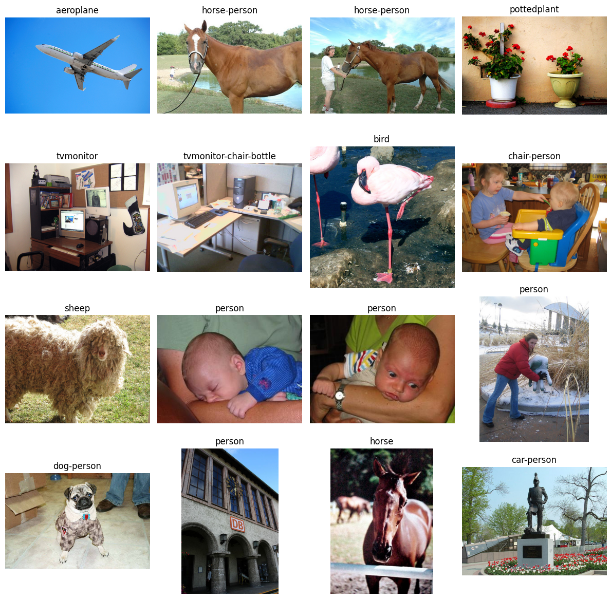
We want to address these outliers from the Clusterer in a similar manner to the way we handled the Linter extreme images, do they represent actual outliers or just underrepresented samples?
In specific context to the Clusterer, we want to focus on these in a class by class manner, so thinking about the person class images only in context of the person class, not the dataset as a whole.
We aren’t going to go through all of these images, but we will go through a few of them.
The first two horse images have a horse with water in the background. There are 238 total horse images and only 5 of them have water in the background. So while these images would be operationally relevant if we were trying to detect horses, they are underrepresented in the dataset. There are only 5 horse images in the whole dataset with water in the background.
The same goes for the third horse image. It is one of 4 images that are a close up picture of a horse standing against a fence or railing. It is most likely flagged as an outlier because it is underrepresented in the dataset.
Likewise with the potted plant, there are only about 4 images with a potted plant up against a solid background out of the 289 potted plant images. Likely this is also just an underrepresented image.
With the dog image, there are 13 dog images wearing an outfit out of 636 dog images and this is the only one in which the dog is sitting while wearing something. Likely an underrepresented image.
With the last two people images that you see, the person is mostly occluded in the second to last one and they are really small and off to the side in the last one.
With the second to last one, it is likely that the image could be dropped unless you will often have occulsion when detecting people.
With the last image, you have to determine how operationally relevant it is. Are you trying to detect people far away or are you focusing on closer images? Also, what is the scale at which an object is too small for detection?
Conclusion
Now comes the fun part, determining what data points are supposed to be in the data set, what points need to be removed, and whether or not you need to collect more data points for a given class or style of image.
The images identified by the Linter and the Clusterer mark images that have something unique about them.
DataEval isn’t able to tell you exactly what’s unique, that’s up to you.
You will want to compare each image with other images in that same class to determine whether it is an under-represented image (scenario?), an image that contains some error and needs to be removed, an image that represents a different class or it could be something else, like a whole class that are always brighter or darker or less varied than the other classes.
As you can see, the DataEval methods are here to help you gain a deep understanding of your dataset and all of it’s limitations and/or under-representated images. It is designed to help you ask the right questions, but it can’t answer those questions for you.
Once you have explored this dataset in comparison to what’s operationally relevant (ie your going to see the same kind of data when your model is deployed), then DataEval offers additional tools to make sure there is not bias or other factors influencing your model’s performance. Learn more about these tools in Identifying Bias and Correlations Guide.
Good luck with your data!