Introduction to data cleaning
Part 1 of our introduction to exploratory data analysis guide
Estimated time to complete: 15 minutes
Relevant ML stages: Data Engineering
Relevant personas: Data Engineer, ML Engineer
What you’ll do
You will use DataEval’s cleaners to assess the 2012 VOC dataset.
You will analyze the results through various plots and tables.
What you’ll learn
You’ll learn how to assess a dataset for extreme and/or redundant data points.
You’ll learn helpful questions to determine when to remove or collect additional data.
What you’ll need
Environment Requirements
dataevalordataeval[all]
Introduction
Exploratory Data Analysis (EDA) is an approach to analyzing data sets to summarize the main characteristics and identify incongruencies in the data. Before diving into machine learning or statistical modeling, it is crucial to understand the data you are working with. EDA helps in understanding the patterns, detecting anomalies, checking assumptions, and determining relationships in the data.
One of the most important aspects of EDA is data cleaning. A portion of DataEval is dedicated to being able to identify duplicates and outliers as well as data points that have missing or too many extreme values. These techniques help ensure that you only include high quality data for your projects.
Step-by-step guide
This guide will walk through how to use DataEval to perform basic data cleaning.
Setup
You’ll begin by importing the necessary libraries to walk through this guide.
import numpy as np
import polars as pl
from dataeval_plots import plot
from IPython.display import display
from maite_datasets.object_detection import VOCDetection

from dataeval import Metadata

# Load the classes from DataEval that are helpful for EDA
from dataeval.config import set_max_processes
from dataeval.core import compute_stats, label_stats
from dataeval.flags import ImageStats
from dataeval.quality import Duplicates, Outliers

# Print all rows of dataframes
_ = pl.Config.set_tbl_rows(-1)

# Set the random value
rng = np.random.default_rng(213)

# Set multiprocessing for DataEval stats
set_max_processes(4)
# Helper method to plot sample images by class
def plot_sample_images_by_class(dataset, image_indices_per_class) -> None:
    import matplotlib.pyplot as plt

    # Plot random images from each category
    _, axs = plt.subplots(5, 4, figsize=(8, 10))

    for ax, (category, indices) in zip(axs.flat, image_indices_per_class.items(), strict=False):
        # Randomly select an index from the list of indices
        ax.imshow(dataset[rng.choice(indices)][0].transpose(1, 2, 0))
        ax.set_title(dataset.metadata["index2label"][category])
        ax.axis("off")

    plt.tight_layout()
    plt.show()


# Helper method to plot images of interest
def plot_sample_outlier_images_by_metric(dataset, outlier_result, metric, layout) -> None:
    import matplotlib.gridspec as gridspec
    import matplotlib.pyplot as plt
    from matplotlib.cm import ScalarMappable
    from matplotlib.colors import Normalize

    # Filter outliers DataFrame for the specific metric
    metric_outliers = outlier_result.data().filter(pl.col("metric_name") == metric)

    if metric_outliers.is_empty():
        print(f"No images flagged for metric: {metric}")
        return

    # Get all metric values from stored calculation results to understand the distribution
    all_metric_values = outlier_result.calculation_results["stats"][metric]
    quantiles = np.quantile(all_metric_values, [0, 0.25, 0.5, 0.75, 1])
    median = quantiles[2]

    # Compute distance from median and sort by most extreme first
    ranked = (
        metric_outliers.unique(subset=["item_index"])
        .with_columns((pl.col("metric_value") - median).abs().alias("_distance"))
        .sort("_distance", descending=True)
        .drop("_distance")
    )

    # Determine number of samples to plot
    n_samples = min(int(np.prod(layout)), ranked.height)

    # Create figure with space for colorbar
    fig = plt.figure(figsize=(12, layout[0] * 4))
    gs = gridspec.GridSpec(
        layout[0],
        layout[1] + 1,
        width_ratios=[1] * layout[1] + [0.05],
        hspace=0.4,
        wspace=0.1,
        left=0.05,
        right=0.92,
        top=0.92,
        bottom=0.02,
    )

    # Create colormap normalization based on full metric distribution
    vmin, vmax = quantiles[0], quantiles[4]
    norm = Normalize(vmin=vmin, vmax=vmax)
    cmap = plt.get_cmap("viridis")

    # Plot images
    for i in range(n_samples):
        row = ranked.row(i, named=True)
        img_id = row["item_index"]
        metric_value = row["metric_value"]
        color = cmap(norm(metric_value))

        ax = fig.add_subplot(gs[i // layout[1], i % layout[1]])
        ax.imshow(dataset[img_id][0].transpose(1, 2, 0))
        ax.set_xlabel(f"index: {img_id}\n{metric}: {np.round(metric_value, 3)}", fontsize=9, color="black")
        ax.set_xticks([])
        ax.set_yticks([])

        # Add colored border to indicate extremeness
        for spine in ax.spines.values():
            spine.set_edgecolor(color)
            spine.set_linewidth(5)
            spine.set_visible(True)

    # Add colorbar with quantile markers
    cbar_ax = fig.add_subplot(gs[:, -1])
    sm = ScalarMappable(cmap=cmap, norm=norm)
    sm.set_array([])
    cbar = plt.colorbar(sm, cax=cbar_ax)
    cbar.set_ticks([])

    quantile_labels = ["Min (Q0)", "Q1 (25%)", "Median (Q2)", "Q3 (75%)", "Max (Q4)"]
    for q_val, q_label in zip(quantiles, quantile_labels, strict=False):
        cbar.ax.axhline(q_val, color="black", linestyle="--", linewidth=0.8, alpha=0.7)
        cbar.ax.text(
            1.5,
            q_val,
            f"{q_label}\n{np.round(q_val, 2)}",
            va="center",
            fontsize=8,
            transform=cbar.ax.get_yaxis_transform(),
        )

    fig.suptitle(f'Outlier Images for "{metric}" (sorted by distance from median)', fontsize=12, y=0.99)
    plt.show()
Step 1: Understand the data
Load the data
You are going to work with the PASCAL VOC 2012 dataset. This dataset is a small curated dataset that was used for a computer vision competition. The images were used for classification, object detection, and segmentation. This dataset was chosen because it has multiple classes and images with a variety of sizes and objects.
If this data is already on your computer you can change the file location from "./data" to wherever the data is
stored. Just remember to also change the download value from True to False.
For the sake of ensuring that this tutorial runs quickly on most computers, you are going to analyze only the training set of the data, which is a little under 6000 images.
# Download the data and then load it as a torch Tensor
ds = VOCDetection("./data", image_set="train", year="2012", download=True)
print(ds)
VOCDetection Dataset
--------------------
    Year: 2012
    Transforms: []
    Image Set: train
    Metadata: {'id': 'VOCDetection_train', 'index2label': {0: 'aeroplane', 1: 'bicycle', 2: 'bird', 3: 'boat', 4: 'bottle', 5: 'bus', 6: 'car', 7: 'cat', 8: 'chair', 9: 'cow', 10: 'diningtable', 11: 'dog', 12: 'horse', 13: 'motorbike', 14: 'person', 15: 'pottedplant', 16: 'sheep', 17: 'sofa', 18: 'train', 19: 'tvmonitor'}, 'split': 'train'}
    Path: /builds/jatic/aria/dataeval/docs/source/notebooks/data/vocdataset/VOCdevkit/VOC2012
    Size: 5717
Inspect the data
As this data was used for a computer vision competition, it will most likely have very few issues, but it is always worth it to check. Many of the large webscraped datasets available for use do contain image issues. Verifying in the beginning that you have a high quality dataset is always easier than finding out later that you trained a model on a dataset with erroneous images or a set of splits with leakage.
# Create the Metadata object
md = Metadata(ds)

lstats = label_stats(md.class_labels, md.item_indices, ds.index2label, image_count=len(ds))

# View per_class data as a DataFrame
pl.DataFrame(
    {
        "class_name": list(ds.index2label.values()),
        "label_count": [lstats["label_counts_per_class"][k] for k in ds.index2label],
        "image_count": [lstats["image_counts_per_class"][k] for k in ds.index2label],
    }
)
| class_name | label_count | image_count |
|---|---|---|
| str | i64 | i64 |
| "aeroplane" | 470 | 328 |
| "bicycle" | 410 | 281 |
| "bird" | 592 | 399 |
| "boat" | 508 | 264 |
| "bottle" | 749 | 399 |
| "bus" | 317 | 219 |
| "car" | 1191 | 621 |
| "cat" | 609 | 540 |
| "chair" | 1457 | 656 |
| "cow" | 355 | 155 |
| "diningtable" | 373 | 318 |
| "dog" | 768 | 636 |
| "horse" | 377 | 238 |
| "motorbike" | 375 | 274 |
| "person" | 5019 | 2142 |
| "pottedplant" | 557 | 289 |
| "sheep" | 509 | 171 |
| "sofa" | 399 | 359 |
| "train" | 327 | 275 |
| "tvmonitor" | 412 | 299 |
The above table shows that this dataset has a total of 20 classes.
Of the classes, person is the class with the highest total object count followed by chair and car, while person,
chair and dog are the classes with the highest number of images.
cow, sheep, and bus are the classes with least number of objects, while bus, train and cow are the classes
with the least number of images.
This table helps point out the wide variation in
the number of classes per image,
the number of objects per image,
and the number of objects of each class per image.
This highlights an important concept - class balance. A dataset that is imbalanced can result in a model that chooses the more prominent class more often just because there are more samples in that class. To explore this concept further, see the bias tutorial in the What’s Next section at the end of this tutorial.
Now that the metadata has been examined, it’s important to inspect random images to get an idea of the variety of backgrounds, the range of colors, the locations of objects in images, and how often an image is seen with a single object versus multiple objects.
plot_sample_images_by_class(ds, lstats["image_indices_per_class"])
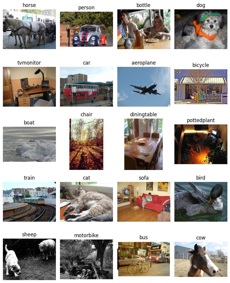
Plotting the images displays the variety in the images, including image sizes, image brightness, object sizes, backgrounds, number of objects in the image, and even the lack of color in a few images which are black and white.
This is where DataEval comes in. It’s designed to help you make sense of the many different aspects that affect building representative datasets and robust models.
In addition to making sure that you understand the structure of the labels and have visualized some of the images from the dataset, you can also visualize the data distribution across different statistics such as the image size or the pixel mean. In order to view these distributions, you have to use DataEval’s stat functions and plot the results.
Now, you can move on to identifying which images have a statistical difference from the rest of the images.
Step 2: Identify any outlying data points
Extreme/missing values
Here you will detect and identify the images associated with the extreme values from DataEval’s stat functions. To
detect these extreme values, you will use the :class:.Outliers class. The Outliers class has multiple methods to
determine the extreme values, which are discussed in the Data Cleaning explanation. For
this guide, you will use the “zscore” as the Z score defines outliers in a normal distribution.
The output of the Outliers class contains a DataFrame with columns for image_id, metric_name, and metric_value for
each flagged outlier.
# This cell takes about 1-5 minutes to run depending on your hardware

# Initialize the Outliers class
outliers = Outliers(outlier_threshold="zscore")

# Find the extreme images
outlier_imgs = outliers.evaluate(ds, per_target=False)

# View the number of extreme images
print(f"Number of images with extreme values: {len(outlier_imgs)}")
Number of images with extreme values: 498
This class can flag a lot of images, depending on how varied the dataset is and which method you use to define extreme values. Using the zscore, it flagged 480 images across 15 metrics out of the 5717 images in the dataset. However, switching the method can give different results.
# List the metrics with an extreme value
outlier_imgs.aggregate_by_metric()
| metric_name | Total |
|---|---|
| cat | u32 |
| "size" | 173 |
| "entropy" | 124 |
| "zeros" | 100 |
| "contrast" | 92 |
| "skew" | 89 |
| "kurtosis" | 73 |
| "brightness" | 52 |
| "width" | 43 |
| "var" | 35 |
| "mean" | 29 |
| "height" | 22 |
| "std" | 22 |
| "darkness" | 20 |
| "aspect_ratio" | 5 |
| "sharpness" | 2 |
Digging into the flagged images and organizing them by category shows that the metric with the most extreme values is “size” while “sharpness” has the least number of extreme values.
Outliers is designed to flag any images on the edge of each metric’s data distribution. Some images will get flagged
as an outlier by multiple metrics, while others will get flagged by only a single metric. It is then up to you, the
user, to shift through the information provided by the result from Outliers.
Part of exploring the results includes displaying how the flagged images are spread across the 20 classes.
# List the outliers by class label
outlier_imgs.aggregate_by_class(md)
| class_name | aspect_ratio | brightness | contrast | darkness | entropy | height | kurtosis | mean | sharpness | size | skew | std | var | width | zeros | Total |
|---|---|---|---|---|---|---|---|---|---|---|---|---|---|---|---|---|
| cat | u32 | u32 | u32 | u32 | u32 | u32 | u32 | u32 | u32 | u32 | u32 | u32 | u32 | u32 | u32 | u32 |
| "person" | 2 | 18 | 86 | 16 | 57 | 2 | 48 | 18 | 0 | 126 | 54 | 1 | 9 | 31 | 70 | 538 |
| "aeroplane" | 0 | 25 | 6 | 4 | 46 | 5 | 35 | 11 | 0 | 14 | 41 | 7 | 1 | 1 | 4 | 200 |
| "bird" | 0 | 17 | 6 | 1 | 27 | 10 | 26 | 1 | 0 | 21 | 32 | 16 | 0 | 1 | 12 | 170 |
| "chair" | 0 | 6 | 21 | 4 | 23 | 1 | 10 | 3 | 0 | 16 | 8 | 0 | 2 | 5 | 30 | 129 |
| "bottle" | 3 | 2 | 20 | 6 | 12 | 0 | 12 | 4 | 0 | 12 | 12 | 1 | 4 | 6 | 13 | 107 |
| "cat" | 0 | 2 | 10 | 1 | 5 | 6 | 3 | 1 | 0 | 30 | 2 | 3 | 9 | 4 | 11 | 87 |
| "car" | 0 | 0 | 9 | 2 | 8 | 3 | 3 | 1 | 0 | 27 | 2 | 0 | 4 | 5 | 11 | 75 |
| "dog" | 0 | 3 | 4 | 0 | 8 | 2 | 1 | 2 | 3 | 30 | 2 | 3 | 2 | 7 | 6 | 73 |
| "boat" | 0 | 2 | 2 | 1 | 9 | 6 | 5 | 1 | 0 | 17 | 6 | 5 | 0 | 0 | 1 | 55 |
| "tvmonitor" | 0 | 0 | 5 | 0 | 2 | 3 | 3 | 0 | 0 | 9 | 2 | 0 | 0 | 2 | 23 | 49 |
| "motorbike" | 0 | 1 | 7 | 4 | 5 | 0 | 2 | 1 | 0 | 12 | 2 | 0 | 2 | 2 | 4 | 42 |
| "bicycle" | 0 | 1 | 3 | 0 | 3 | 0 | 2 | 1 | 0 | 14 | 3 | 0 | 0 | 8 | 3 | 38 |
| "pottedplant" | 0 | 1 | 5 | 0 | 1 | 0 | 0 | 1 | 0 | 4 | 2 | 0 | 12 | 0 | 9 | 35 |
| "train" | 0 | 3 | 0 | 0 | 4 | 2 | 0 | 2 | 0 | 12 | 0 | 1 | 5 | 2 | 4 | 35 |
| "sofa" | 0 | 0 | 4 | 0 | 4 | 2 | 1 | 0 | 0 | 10 | 1 | 0 | 5 | 3 | 3 | 33 |
| "cow" | 0 | 0 | 1 | 0 | 1 | 1 | 4 | 0 | 0 | 8 | 4 | 0 | 3 | 7 | 1 | 30 |
| "bus" | 0 | 0 | 1 | 0 | 2 | 0 | 3 | 1 | 0 | 9 | 3 | 1 | 1 | 2 | 4 | 27 |
| "diningtable" | 0 | 1 | 3 | 0 | 2 | 0 | 1 | 0 | 0 | 6 | 2 | 0 | 2 | 0 | 5 | 22 |
| "horse" | 0 | 0 | 2 | 0 | 2 | 0 | 0 | 0 | 0 | 6 | 0 | 0 | 0 | 0 | 3 | 13 |
| "sheep" | 0 | 0 | 1 | 0 | 0 | 0 | 1 | 0 | 1 | 3 | 1 | 0 | 2 | 0 | 1 | 10 |
| "Total" | 5 | 82 | 196 | 39 | 221 | 43 | 160 | 48 | 4 | 386 | 179 | 38 | 63 | 86 | 218 | 1768 |
Some of the trends to note from the table above which splits the issues by class and metric:
An image with an unusual aspect ratio is most likely to contain a bottle or person.
An image with an issue in brightness is most likely to contain an aeroplane.
An image with an issue in darkness is most likely to be a person.
Images with high contrast are likely to fall within 1 of 4 classes: bottle, cat, chair, person.
Images with low entropy (think image with constant pixels) are likely to fall within 1 of 4 classes: aeroplane, bird, bottle, person.
Unusual skew and kurtosis images follow a similar trend as entropy.
Every class has images with size issues.
Something to remember is that there are different number of images for each class and that effective use of this tool requires understanding the dataset in question. For example, 36 low entropy images out of the 2000 for person might be outliers while 28 low entropy images out of 300 for aeroplane might not be; low entropy might be an inherent characteristic of the aeroplane class.
In order to understand the above table, you will plot sample images from a few of the metrics, specifically:
entropy
size
zeros
sharpness
Entropy, variance, standard deviation, kurtosis, and skew all measure (in different ways) how much change there is across the pixels in the image, and entropy will be the easiest to understand.
Size, width, height and aspect ratio are all interrelated and size has the most extreme images from those.
Zeros is a category unto itself but it is closely related to brightness, contrast, darkness, and mean. Zeros measures the percentage of pixels with a zero value compared to the average image.
Sharpness is also in it’s own category and it measures the perceived edges in an image.
Questions
When looking at these images, you want to think about the following questions:
Does this image represent something that would be expected in operation?
Is there commonality to the objects in the images?
Is there commonality to the backgrounds of the images?
Is there commonality to the class of objects in the images?
Asking these questions will help you notice things like all objects being located on the leftside of the image or all the images of a specific class have a specific background. Training a model with data that has commonalities can cause your model to develop biases or limit your model’s ability to generalize to non-training data.
Entropy
# Plot images flagged for "entropy"
plot_sample_outlier_images_by_metric(ds, outlier_imgs, "entropy", (1, 4))
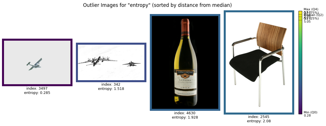
When you examine the flagged images for entropy, look for patterns in the content of the images. Many of these images may feature backgrounds with very little variation, such as water or sky. Others might have darker backgrounds than usual.
For example, in an operational setting, water or sky backgrounds may or may not appear frequently, depending on the expected use case. Similarly, darker images may indicate low-light conditions, which could suggest either operational relevance (e.g., night operations) or anomalies that need to be addressed.
To refine your dataset, decide whether these flagged images represent scenarios that align with your goals. If they do, consider collecting more data with similar characteristics to balance your dataset. If not, these images may be excluded as outliers.
Aspect ratio
# Plot images flagged for "aspect_ratio"
plot_sample_outlier_images_by_metric(ds, outlier_imgs, "aspect_ratio", (1, 4))
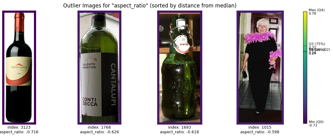
Flagged images for aspect ratio often include examples where the objects in the image are unusually wide or tall relative to the rest of the dataset. For instance, bottle images might by cropped tall.
If your workflow involves preprocessing images to a uniform size, verify that resizing does not distort important details. For example, cropping could remove key parts of the image, while resizing could stretch or compress objects. Alternatively, if you plan to filter images based on size, ensure this doesn’t introduce bias—for example, by disproportionately excluding images of certain classes or contexts.
After evaluating the flagged images, you may notice that dimensional discrepancies are common across multiple classes, as shown in the earlier table. This observation suggests that these issues are a general feature of the dataset, and dropping all size outliers might be an appropriate step. However, be cautious and verify whether this action creates any imbalances.
Zeros
# Plot images flagged for "zeros"
plot_sample_outlier_images_by_metric(ds, outlier_imgs, "zeros", (1, 4))
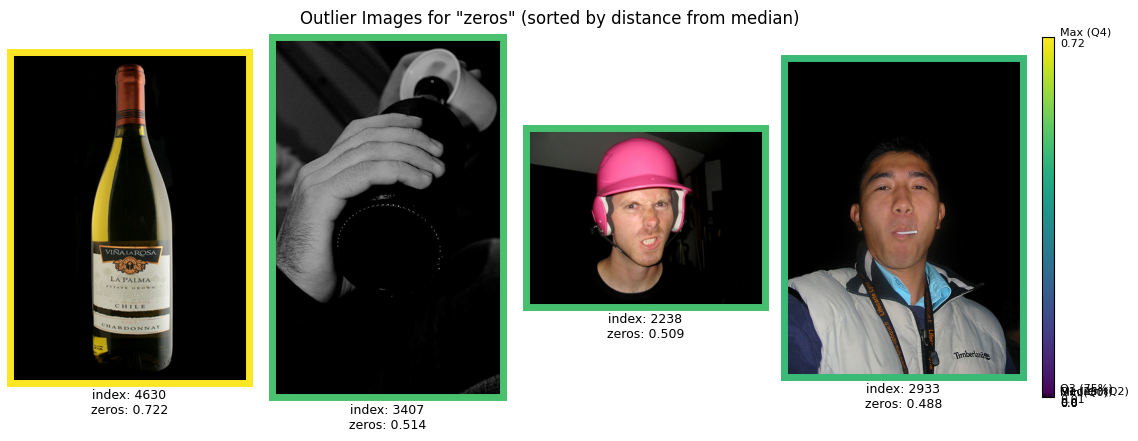
Images flagged for zeros typically feature large regions of completely black or gray pixels. Some of these may also appear in grayscale. These characteristics could indicate issues like underexposed photos, scanning errors, or specific use cases.
Grayscale images, in particular, might stand out if the rest of your dataset is primarily in color. Check whether grayscale images are relevant to your operational scenario or whether they are artifacts of the data collection process.
For instance, if grayscale images are operationally irrelevant, consider removing them. However, if grayscale scenarios are possible, ensure that you have sufficient representation of these types of images to train a robust model. Similarly, dark images with many zero-value pixels may indicate rare but valid scenarios (e.g., nighttime operations) or irrelevant anomalies.
Sharpness
# Plot images flagged for "sharpness"
plot_sample_outlier_images_by_metric(ds, outlier_imgs, "sharpness", (1, 2))
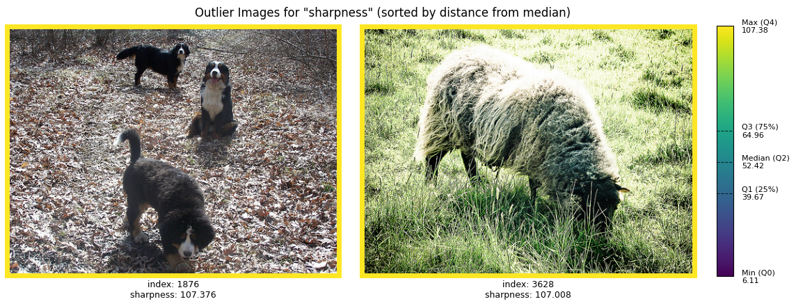
Sharpness measures the clarity of edges in an image. Flagged images often include those with unusually crisp or blurry details. For instance, you might notice a close-up shot of leaves or grass, where the texture stands out significantly compared to other images in the dataset.
Evaluate whether these highly detailed images are typical of your use case. If they are uncommon in your operational scenario, they might skew your model’s ability to generalize. In such cases, consider excluding these images. Conversely, if they are operationally relevant, ensure that similar images are sufficiently represented in your dataset to prevent biases.
Cleaning summary
The Outliers class identifies images that deviate significantly from the dataset’s overall distribution. While it cannot determine operational relevance, it highlights patterns that may require further investigation.
For example, flagged images might reflect real-world scenarios underrepresented in your dataset, such as night operations or objects photographed from unusual angles. Alternatively, they may reveal anomalies, such as artifacts from the data collection process.
By reviewing flagged images for multiple metrics and examples, you can better understand how the Outliers class identifies extremes. This hands-on exploration helps you decide whether to include or exclude specific images based on your dataset’s intended use.
Step 3: Identify duplicate data
Duplicates
Now that you know how to identify poor quality images in your dataset, another important aspect of data cleaning is detecting and removing any duplicates.
The Duplicates class identifies both exact duplicates and potential (near) duplicates. Potential duplicates can occur
in a variety of ways:
Intentional perturbations
Images with varying brightness
Translating the image
Padding the image
Cropping the image
Unintentional changes
Copying the image from one format to another (png->jpeg)
Using the same image with two different filenames
Duplicate frames from video extraction
Oversight in the data collection process
# Initialize the Duplicates class
dups = Duplicates(ImageStats.HASH)

# Find the duplicates
results = dups.evaluate(ds, per_target=False)
# View duplicate groups
display(results)
shape: (1, 6)
┌──────────┬───────┬──────────┬──────────────┬─────────────────────────────────┬─────────────┐
│ group_id ┆ level ┆ dup_type ┆ item_indices ┆ methods                         ┆ orientation │
│ ---      ┆ ---   ┆ ---      ┆ ---          ┆ ---                             ┆ ---         │
│ i64      ┆ str   ┆ str      ┆ list[i64]    ┆ list[str]                       ┆ str         │
╞══════════╪═══════╪══════════╪══════════════╪═════════════════════════════════╪═════════════╡
│ 0        ┆ item  ┆ near     ┆ [1548, 1561] ┆ ["dhash", "dhash_d4", … "phash… ┆ same        │
└──────────┴───────┴──────────┴──────────────┴─────────────────────────────────┴─────────────┘
As expected there are no exact duplicate images in this dataset, since it was curated for a specific competition. But there are near duplicates detected by phash and dhash.
_ = plot(ds, figsize=(12, 6), indices=(1548, 1561))
As you can see, the image is indeed a near duplicate; image 1561 is a grayscale version of image 1548.
To highlight the abilities of the Duplicates class, you will add some duplicates to the dataset and then rerun the
Duplicates class.
# Create exact and duplicate images

# Copy images 23 and 46 to create exact duplicates
# Copy and crop images 5 and 4376 to create near duplicates
# Rotate image 100 by 90 degrees to create a rotated duplicate
# Mirror and rotate image 200 to create a mirrored+rotated duplicate
dupes = [
    ds[23][0],  # exact duplicate
    ds[46][0],  # exact duplicate
    ds[5][0][:, 2:-2, 2:-2],  # cropped near duplicate
    ds[4376][0][:, :-5, 5:],  # cropped near duplicate
    np.rot90(ds[100][0], k=1, axes=(1, 2)),  # 90° rotation
    np.flip(np.rot90(ds[200][0], k=2, axes=(1, 2)), axis=2),  # 180° rotation + horizontal flip
]

dupes_stats = compute_stats(dupes, stats=ImageStats.HASH)
# Find the duplicates appended to the dataset
duplicates = dups.from_stats([dups.stats, dupes_stats])

# View all duplicate groups
display(duplicates)
shape: (7, 7)
┌──────────┬───────┬──────────┬──────────────┬───────────────────────┬─────────────┬───────────────┐
│ group_id ┆ level ┆ dup_type ┆ item_indices ┆ methods               ┆ orientation ┆ dataset_index │
│ ---      ┆ ---   ┆ ---      ┆ ---          ┆ ---                   ┆ ---         ┆ ---           │
│ i64      ┆ str   ┆ str      ┆ list[i64]    ┆ list[str]             ┆ str         ┆ list[i64]     │
╞══════════╪═══════╪══════════╪══════════════╪═══════════════════════╪═════════════╪═══════════════╡
│ 0        ┆ item  ┆ exact    ┆ [23, 0]      ┆ ["xxhash"]            ┆ null        ┆ [0, 1]        │
│ 1        ┆ item  ┆ exact    ┆ [46, 1]      ┆ ["xxhash"]            ┆ null        ┆ [0, 1]        │
│ 2        ┆ item  ┆ near     ┆ [5, 2]       ┆ ["phash", "phash_d4"] ┆ same        ┆ [0, 1]        │
│ 3        ┆ item  ┆ near     ┆ [100, 4]     ┆ ["dhash_d4",          ┆ rotated     ┆ [0, 1]        │
│          ┆       ┆          ┆              ┆ "phash_d4"]           ┆             ┆               │
│ 4        ┆ item  ┆ near     ┆ [200, 5]     ┆ ["dhash_d4",          ┆ rotated     ┆ [0, 1]        │
│          ┆       ┆          ┆              ┆ "phash_d4"]           ┆             ┆               │
│ 5        ┆ item  ┆ near     ┆ [1548, 1561] ┆ ["dhash", "dhash_d4", ┆ same        ┆ [0, 0]        │
│          ┆       ┆          ┆              ┆ … "phash…             ┆             ┆               │
│ 6        ┆ item  ┆ near     ┆ [4376, 3]    ┆ ["phash", "phash_d4"] ┆ same        ┆ [0, 1]        │
└──────────┴───────┴──────────┴──────────────┴───────────────────────┴─────────────┴───────────────┘
As shown above, the Duplicates class identified all images from the second dataset as exact or near duplicates. The
results are returned as a DataFrame where each row is a duplicate group with columns for group_id, level, dup_type
(exact/near), item_indices, methods, orientation, and dataset_index (for cross-dataset results).
Exact duplicates: Images 23 and 46 from dataset 0 are identified as exact duplicates of images 0 and 1 from dataset 1 respectively.
Same-orientation near duplicates: Images 5 and 4376 from dataset 0 are identified as near duplicates of images 2 and 3 from dataset 1 (cropped versions). These are detected by both basic hashes (phash, dhash) and D4 hashes.
Rotated/flipped duplicates: Images 100 and 200 from dataset 0 are identified as duplicates of images 4 and 5 from dataset 1 (rotated and mirrored+rotated versions). These are detected only by D4 hashes (phash_d4, dhash_d4) because the basic perceptual hashes are orientation-sensitive. The orientation column shows “rotated” for these groups.
By using ImageStats.HASH (which computes both basic and D4 hashes), you can distinguish between same-orientation
duplicates and rotated/flipped duplicates by checking the methods and orientation columns. This is useful when you want
to:
Keep one version of each rotated duplicate set
Identify images that may have been augmented with rotations
Detect unintentional orientation variations in your dataset
Conclusion
Through this process, you’ve learned how to use DataEval’s Outliers class to identify and analyze images that deviate
from the overall distribution of your dataset and DataEval’s Duplicates class to identify exact and near duplicates.
By examining the images flagged by the different metrics, you gained a deeper understanding of potential issues within
your dataset. In this tutorial, the following were covered:
Underrepresented classes that may require additional data collection.
Inconsistencies in image characteristics, such as brightness, sharpness, or size, which could affect model performance.
Duplicate data that can affect model performance.
This work has provided a clearer picture of your dataset’s strengths and limitations. You are now equipped to make informed decisions about which data points to keep, remove, or augment. For example, you may decide to exclude irrelevant outliers, collect more data for underrepresented scenarios, or address biases that could impact your model’s generalizability.
By using DataEval, you are not just refining your dataset—you are laying the groundwork for creating a more representative, balanced, and reliable dataset. These insights ultimately enable the development of models that perform robustly in real-world operational settings.
DataEval’s tools empower you to move from raw data to actionable insights, ensuring your dataset is not only comprehensive but also aligned with your specific goals and requirements.
Good luck with your data!
What’s next
Learn how to do the following:
To learn more about specific functions or classes, see the API Reference section. To learn more about data cleaning, see the Data Integrity explanation page.
On your own
Now that you’ve gone through a tutorial on exploring a dataset, try going through the tutorial again with the test set, full dataset, or even your own dataset. One thing to look for when checking other sets of data is to observe how the stats of each grouping of data changes or doesn’t change.
You can also play around with the different statistical methods that the Outlier class employs to see how the method
affects the number and type of issues detected.